
What is Responsive Design and Why It’s Important for Websites in 2025.
Find out what responsive design is, how it works, and why it’s critical for modern websites. Responsive design can help you improve user experience, SEO, and Conversions.
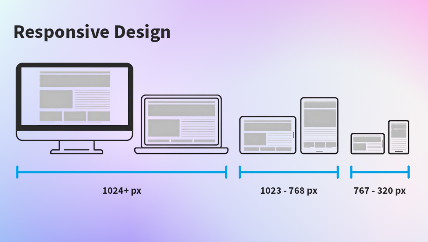
People may view your website on phones, tablets, laptops, desktops, and even televisions. Each device will have a different screen size. A responsive design ensures your website adapts to the device and still looks great. It also ensures it is fast and easy to use.
So, what is responsive design and why is it important for your website in 2025?
To put it simply, responsive design is when your website adjusts to fit any screen size. Instead of having multiple versions of your website for phones, tablets, and desktops, your site responds to whatever you are using. Responsive websites use flexible grids and CSS, to move and resize elements as you view the page. For example, if you see several columns on a desktop, it might be a single column on a phone, and it will still be easy to read and navigate.
Why responsive design is essential for websites
1. Improved User Experience (UX)
Responsive website design does not force users to zoom, or scroll horizontally. This is important for readability and ease of browsing. A seamless experience keeps users on the website, meaning lower bounce rates.
2. Improved search engine rankings
Google gives preferential treatment to mobile-friendly websites in its search results, and it is now standard practice for Google to be mobile-first in its indexing. Responsive website design is important for SEO. Read more at Google about mobile-first design.
3. Time and money saving and easier website maintenance
A responsive website design uses only one website design instead of two (desktop and mobile). This reduces the costs for web development and makes updating the site easier.
4. Increased traffic and conversions
According to Statista.com, over 60% of internet traffic comes from mobile devices so responsive website design can help attract more users and improve conversions.
5. Make Your Website Future-Proof
New devices (with different screen sizes) are taking over the market. Responsive design means your website can accommodate these devices without needing to redesign the website each time a new one emerges.
Responsive Website Examples :
- Amazon -Whetherausershopson mobile or desktop, the shopping experience flows seamlessly.
- BBC News – Their content adjusts nicely, regardless of the device it is viewed on.
- Airbnb – A smooth experience on their website mapping out and booking, no matter how large or small the screen.
Key Components of Responsive Design
Fluid gridlayout– Content sizesbased on proportional resizing instead of fixed dimensions.
Flexible images/media – Images and videos resize based on screen size.
Media queries – CSS rules that change layouts based on devices.
Mobile-friendly navigation – Menus/buttons that are easy to tap on screens.
Consistent user experience – The website looks professional on any device.
How to Find Out If Your Website is Responsive
You can use some free tools like:
- Google Mobile-Friendly Test
- Responsive Design Checker
You simply enter the URL of your website when using these tools to find out what the website looks like when viewed on different devices.
Summary
Responsive design used to be optional, now it is a given and standard in any modern website. It makes the user experience better, helps with SEO rankings, reduces costs, and helps ensure your website is relevant across devices.
If you plan to design, or redesign, your website make sure to put responsiveness at the top of your checklist.
If you need help, it may be time to hire a web design company who specializes in responsive websites to help you maintain a competitive edge for your business online.
At Tryangle Tech we build modern and responsive websites that are also SEO-friendly. We are committed to providing innovative websites built with your business’s needs in mind, to ensure you can grow your online presence with confidence.


