
UI Design 2026 How simplicity is outperforming complex layouts
Table of Contents
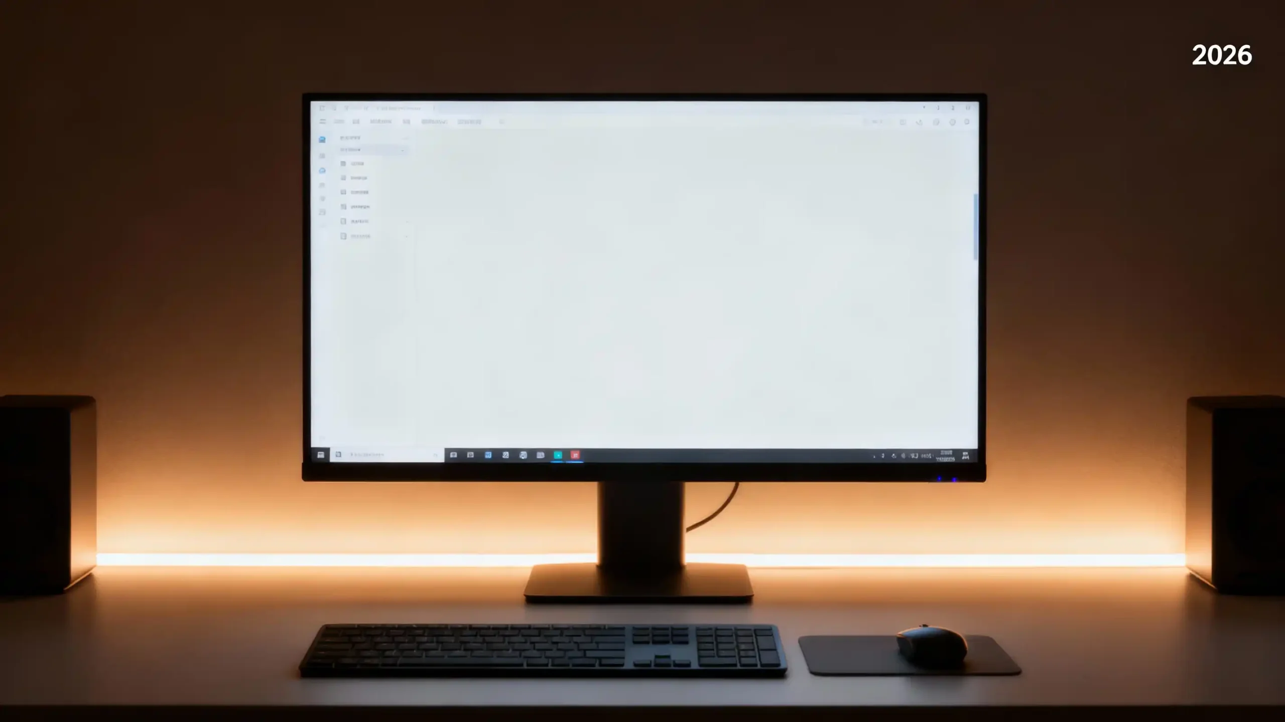
Have you noticed how almost every modern website and app feels cleaner than before? Less clutter, fewer distractions, and more breathing room. It is not a coincidence. People are tired of complicated interfaces. They just want things that work, feel natural, and make sense instantly.
That is why simple UI is winning in 2026. It is not about making a screen empty. It is about making it easy.
Let us talk about why simplicity is taking over and why businesses should care.
What simple UI actually means today
Simple UI is not plain. It is not dull. It does not mean removing creativity. It means keeping only what matters.
A simple interface usually • shows clear text • has enough space around each element • follows a clean and logical flow • makes buttons easy to recognise • avoids anything that makes users think too hard
It is the digital version of walking into a tidy room instead of a messy one. You instantly feel comfortable. You instantly understand where everything is.
If a user needs a second to figure out what to click, the design is already failing them.
For a deeper look at how design affects user experience, you can read your existing post on Responsive Design and Why It Matters.
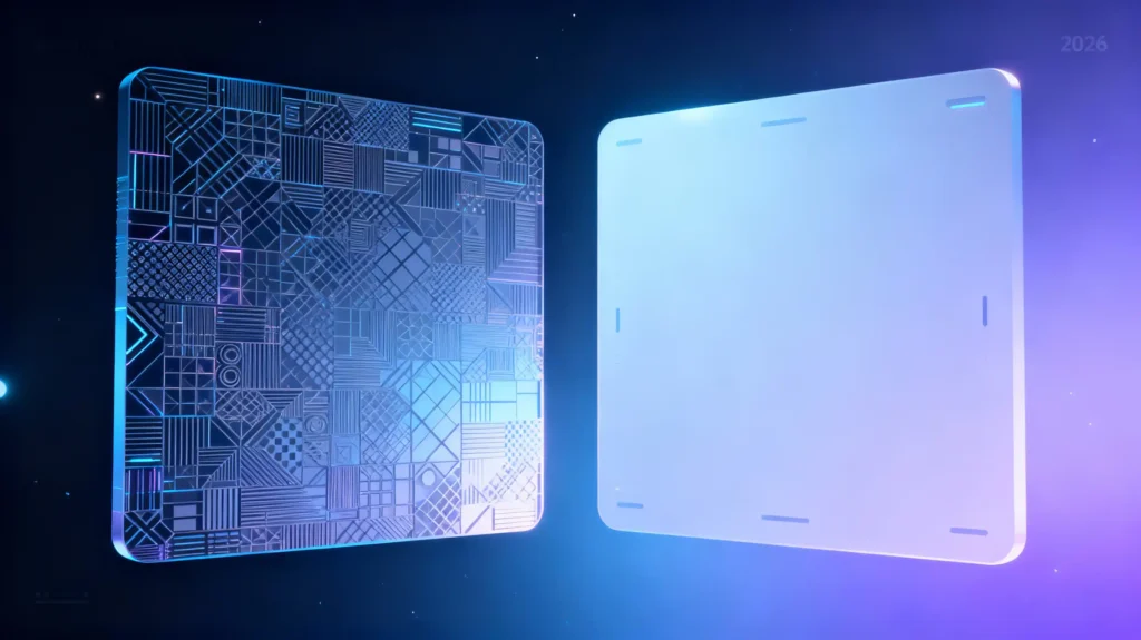
Why complex UI used to be a trend
There was a time when everyone wanted fancy animations, bright gradients, moving shapes, and extremely detailed visuals. It looked impressive and designers loved experimenting.
But here is the truth. It looked good only until the moment the user tried to get something done.
Complex designs often • load slower • confuse users • make navigation harder • hide important actions behind pretty visuals
When the internet was newer, people had patience to explore. Now they do not.
If you want to try improving performance, your article on Speeding Up WordPress is a great resource.
How user behaviour changed in 2026
This is the real reason simple UI is winning. People use websites differently now.
Three big changes • everyone has less time • most browsing happens on mobile • AI has trained people to expect instant clarity
If a page looks confusing, users leave within seconds. Tools like Hotjar and Microsoft Clarity show this clearly. People want answers fast. They want actions to be obvious.
This is why simple UI feels right. It works with modern behaviour instead of fighting against it.
For SEO and user behaviour insights, your visitors can check your post on On Page vs Off Page SEO.
Why simple UI performs better
Here are the biggest reasons simplicity outperforms complex design in real life.
Users make decisions faster
When the interface is clean, the brain processes it quickly. No guessing. No searching around. One look and the user knows what to do.
Navigation feels natural
Simple layouts guide the user without them realising it. They go where you want them to go.
Better loading speed
Fewer elements means fewer files and less weight. This directly boosts performance and even helps SEO. Google’s official documentation confirms this too
More accessible for everyone
Simple UI usually has better contrast, bigger tap areas, and more consistent patterns. It automatically helps users with disabilities.
Lower mental effort
You know that relaxing feeling when a page looks clean and organised? That is exactly what simple UI offers.
Higher trust
People trust what they understand. A cluttered layout makes them doubt the brand. A clean layout makes them feel safe.
Content becomes the hero
The design steps back and lets your product or message shine.
Real world examples that prove it works
It shows one search box and minimal extras. That is all it needs.
Clean chats. Clear icons. Simple navigation. Even non tech users understand it.
Apple
Big spacing. Clean surfaces. Clear typography. Users instantly feel the premium experience.
Notion
People love it because it feels peaceful. No visual noise.
These brands are not simple because they lack ideas. They are simple because they know what matters.
Simple UI helps conversions more than you think
Businesses often think good design means more graphics, more effects, more sections. The truth is the opposite. Simplicity leads to • more leads • more purchases • fewer abandoned sessions • higher engagement
When the design stays out of the way, users move straight toward the goal.
If you want to help people improve their SEO conversions too, your post on How Web Development Affects SEO fits perfectly.
Why simple UI works best on mobile
Most users scroll on a mobile screen. This means everything needs to be • readable • tappable • uncluttered • fast
Simple design naturally fits these requirements. Complex design usually breaks on smaller screens or feels overwhelming.
For a full mobile perspective, your post on Why Your Business Needs a Mobile First Website is a perfect pairing.
How to simplify your design without losing personality
Here are friendly tips any business can apply • reduce the number of items on each screen • use generous spacing • choose readable fonts • keep navigation short and clear • highlight one main action per page • use animations only when they help the user • keep colors consistent and calm
Simplicity is not about removing personality. It is about letting the personality stand out clearly.

Mistakes to avoid
A few things can go wrong when simplifying • removing important content just to look clean • making text too small or too light • replacing words with vague icons • using too much empty space without structure • forgetting tablet view while focusing on mobile and desktop
Always balance beauty with usability.
What businesses should focus on in 2026
If a business wants a website that feels modern and trustworthy, simplicity is the best foundation.
Focus on • clean layout • fast loading • clear message • strong spacing • fewer distractions • mobile friendly structure
This not only improves the experience but also helps rankings, trust, and conversions.
For a strong next step, visitors can also read your post on Graphic Design Trends for 2025.
Conclusion
Simplicity is not a trend anymore. It is becoming the standard. Users want clarity. They want comfort. They want speed. A simple interface delivers all of that.
Simple UI does not look basic. It looks thoughtful. It looks confident. It looks modern. And in 2026, that is exactly what wins.


